Tutorial: Lots of Plots
This tutorial assumes that you already know how to use Python to read LIGO data files. If you don't, you may want to take a look at the Introductory Tutorial before you go any further.
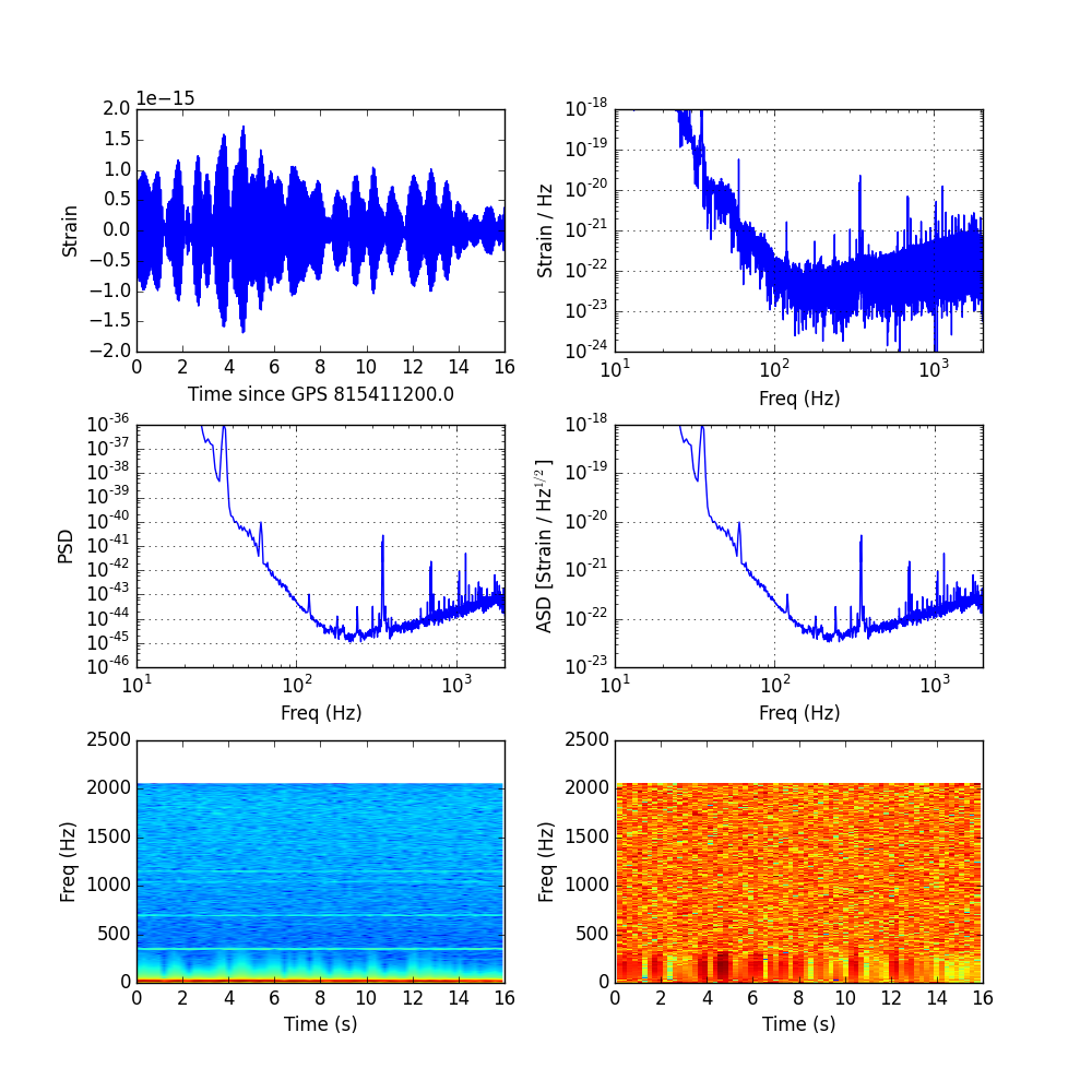
This tutorial will show you how to make a few common plots with time series data, including a Fourier domian representation, an amplitude spectral density, and a spectrogram.
Create a file called lotsofplots.py and start with the following
code:
import numpy as np
import h5py
import matplotlib.pyplot as plt
import matplotlib.mlab as mlab
import readligo as rl
Notice that ReadLIGO just refers to the
python library
described in step 4, which read data from a LIGO
data file. Of course, you can also write your own code for this. We also added
the mlab module from matplotlib, which includes a
function to calculate a power spectral density (PSD).
To start, we'll read the strain data and data quality information from the LIGO data file that you downloaded in step 1 of the introductory tutorial:
fileName = 'fileName = 'H-H1_LOSC_4_V1-815411200-4096.hdf5'
strain, time, channel_dict = rl.loaddata(fileName)
ts = time[1] - time[0] #-- Time between samples
fs = int(1.0 / ts)          #-- Sampling frequency
To make some example plots, let's pick a segment of "good data", and then work with just the first 16 seconds of data in the segment:
segList = rl.dq_channel_to_seglist(channel_dict['DEFAULT'], fs)
length = 16  # seconds
strain_seg = strain[segList[0]][0:(length*fs)]
time_seg = time[segList[0]][0:(length*fs)]
In the example, we'll use pyplot.suplot so that all of the plots
will be on one figure. You may prefer to use pyplot.figure()
instead to make separate figures. To set up a grid of 6 figures, with a little
extra space for axis labels:
fig = plt.figure(figsize=(10,10))
fig.subplots_adjust(wspace=0.3, hspace=0.3)
plt.subplot(321)
Plot a Time Series
You can plot the time series data like this:
plt.plot(time_seg - time_seg[0], strain_seg)
plt.xlabel('Time since GPS ' + str(time_seg[0]))
plt.ylabel('Strain')
If you don't see the plot, try the command plt.show().
Fourier Transform (FFT)
Next, let's try plotting the data in the Fourier domain, using a Fast Fourier Transform (FFT). Because GWOSC data has a great deal of excess noise at low frequencies, spectral leakage is often an issue. To mitigate this, we'll apply a Blackman Window before we take the FFT:
window = np.blackman(strain_seg.size)
windowed_strain = strain_seg*window
freq_domain = np.fft.rfft(windowed_strain) / fs
freq = np.fft.rfftfreq(len(windowed_strain))*fs
The vector returned in freq_domain is complex. Let's just plot
the magnitude of this vector:
plt.subplot(322)
plt.loglog( freq, abs(freq_domain))
plt.axis([10, fs/2.0, 1e-24, 1e-18])
plt.grid('on')
plt.xlabel('Freq (Hz)')
plt.ylabel('Strain / Hz')
Power Spectral Density and Amplitude Spectral Density
Plotting in the Fourier domain gives us an idea of the frequency content of the data. Another way to visualize the frequency content of the data is to plot the power spectral density:
Pxx, freqs = mlab.psd(strain_seg, Fs = fs, NFFT=fs)
plt.subplot(323)
plt.loglog(freqs, Pxx)
plt.axis([10, 2000, 1e-46, 1e-36])
plt.grid('on')
plt.ylabel('PSD')
plt.xlabel('Freq (Hz)')
You can also plot an amplitude spectra density the same way, just by taking
the square root, np.sqrt(), of Pxx.
Spectrograms
A spectrogram shows the power spectral density of a signal in a series of time bins. Pyplot has a convienient function for making spectrograms:
NFFT = 1024
window = np.blackman(NFFT)
plt.subplot(325)
spec_power, freqs, bins, im = plt.specgram(strain_seg, NFFT=NFFT, Fs=fs,
                                    window=window)
Mainly, this spectrogram shows what we already knew from the PSD: there is a
lot more power at very low frequencies than high frequencies. If we are
looking for time variation in the data, it can be helpful to normalize each
frequency bin by the typical power at that frequency. We can do this, and then
re-plot the spectrogram, using the colormesh function:
med_power = np.zeros(freqs.shape)
norm_spec_power = np.zeros(spec_power.shape)
index = 0
for row in spec_power:
    med_power[index] = np.median(row)
    norm_spec_power[index] = row / med_power[index]
    index += 1

ax = plt.subplot(326)
ax.pcolormesh(bins, freqs, np.log10(norm_spec_power))