Plot Gallery
To make any plot shown on this page, start with the following code to read the
strain data and data quality information from the
LIGO data file
that you downloaded in
step 1 of the introductory tutorial.
ReadLIGO refers to the
library
described in step 4, which reads data from a LIGO
data file:
import numpy as np
import matplotlib.pyplot as plt
import matplotlib.mlab as mlab
import readligo as rl

fileName = 'H-H1_LOSC_4_V1-815411200-4096.hdf5'
strain, time, channel_dict = rl.loaddata(fileName)
ts = time[1] - time[0]      #-- Time between samples
fs = int(1.0 / ts)          #-- Sampling frequency

#-- Choose a few seconds of "good data"
segList = rl.dq_channel_to_seglist(channel_dict['DEFAULT'], fs)
length = 16  # seconds
strain_seg = strain[segList[0]][0:(length*fs)]
time_seg = time[segList[0]][0:(length*fs)]
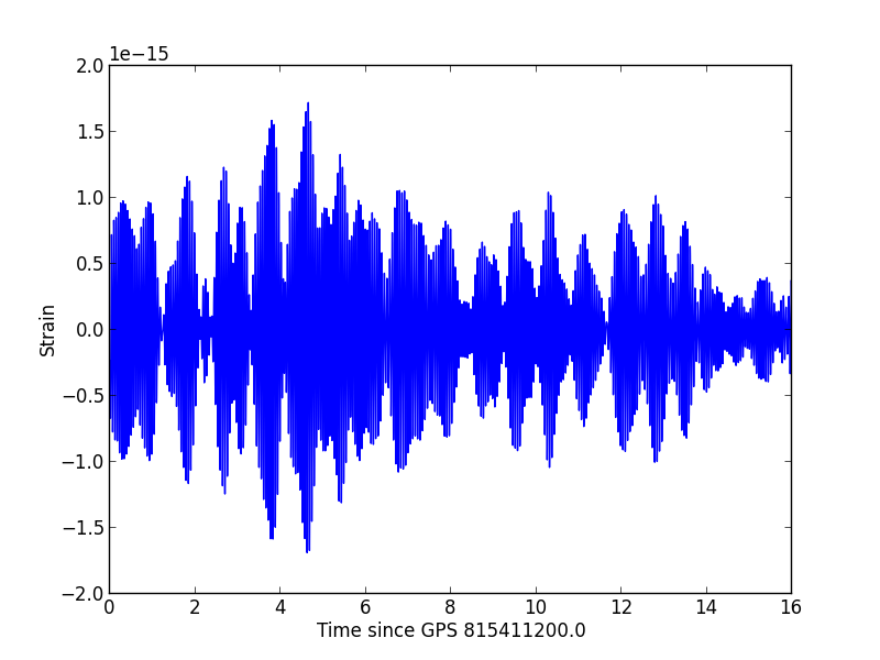
Plot the time series
The strain time series, or h(t). This is the most direct plot of LIGO data. The time series is dominated by low frequency noise, which appears as smooth oscillations at around 20 Hz.
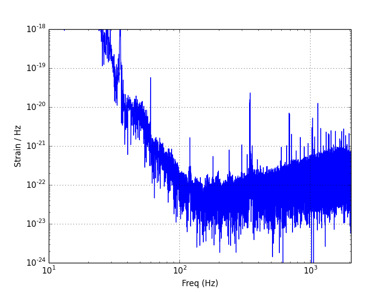
FFT with Blackman Window
A Fast Fourier Transform, or FFT, is one method to transform the data into the frequency domain. Here, we first apply a Blackman Window to force the data to zero at the time boudaries, and so reduce edge effects in the FFT. The LIGO noise spectrum is seen to have the most power at low frequencies (f < 50 Hz), due mainly to seismic noise. The most sesitive band, often called "The Bucket", is roughly 100 - 300 Hz.
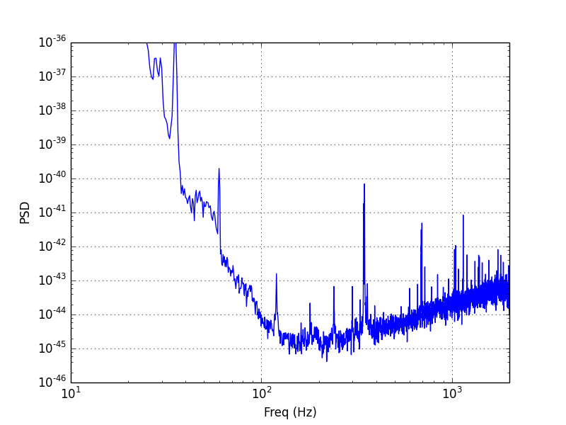
Power Spectral Density (PSD)
The Power Spectral Density is another representation of how the power in the
data is distributed in frequency space. Matplotlib's psd method
use's Welch's method to estimate the PSD. The method divides the data into
segments with NFFT samples, computes a periodogram of each
segment (similar to the FFT plotted above), and then takes the time average of
the periodograms. This averaging over several segments reduces the variance in
the result, which is why the PSD looks "thinner" than the FFT.
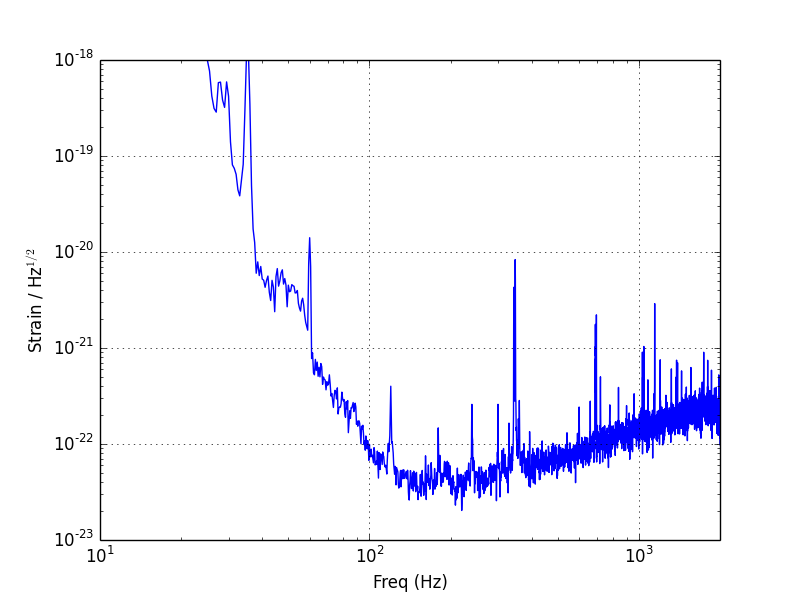
Amplitude Spectral Density (ASD)
The ASD can be obtained by taking the square root of the PSD. This is done to give units that can be more easily compared with the time domain data or FFT. More information about the LIGO ASD can be seen on the Instrumental Lines page.
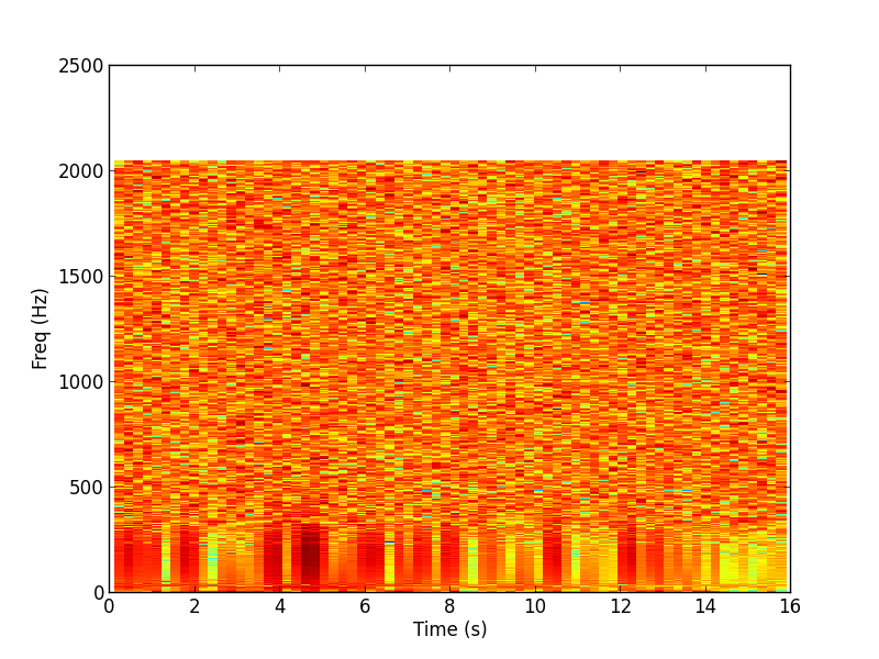
Spectrogram
This spectrogram shows how the PSD of the data varies as a function of time. The main feature we see is that the low frequencies contain more power than the high frequencies, as in the above plots.

Spectrogram renormalized to the median power in each frequency bin
In this spectrogram, the power in each frequency bin has been normalized by the median power for that bin. This "whitens" the data. The remaining spectrogram shows how the power fluctuates in time. Such whitened spectrograms are useful for visualizing transient signals. For example, this simulated inspiral is plotted using a technique similar to a whitened spectrogram. You can also see how to visualize a Burst hardware injection in the "Find a Burst Injection" tutorial.